De Young & Legion of Honor Redesign
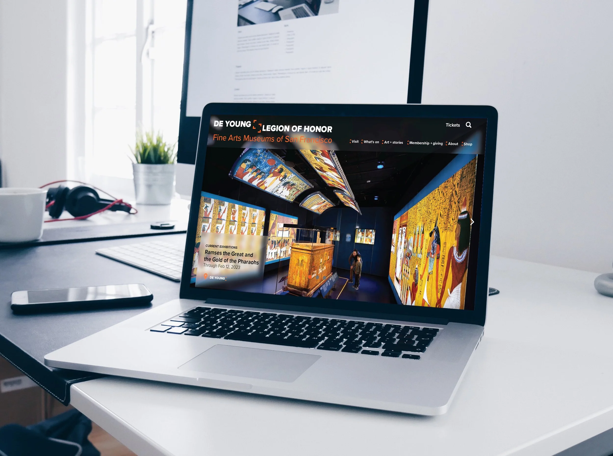
This is a redesign of the De Young & Legion of Honor identity. The two museums are deeply connected so it was important to create a logo that shows that relationship. When you buy a ticket to one museum you are granted free access to the other as well.
There is such a high standard for museum identities and the museums current identity does not reflect that.
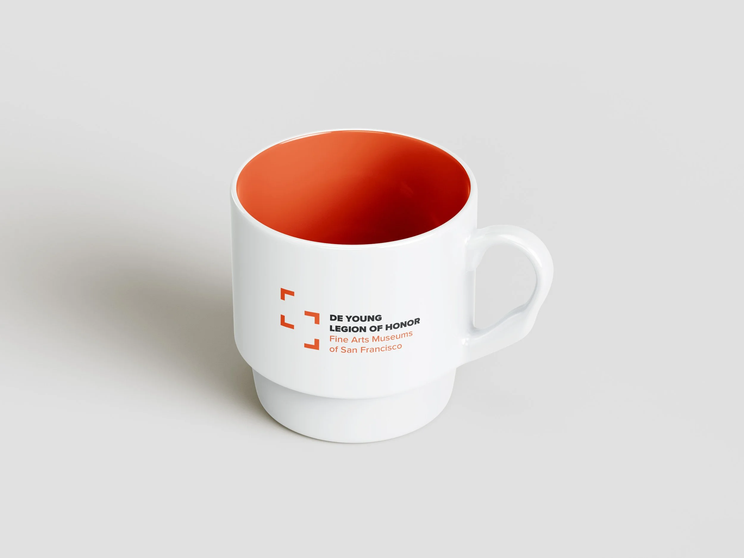
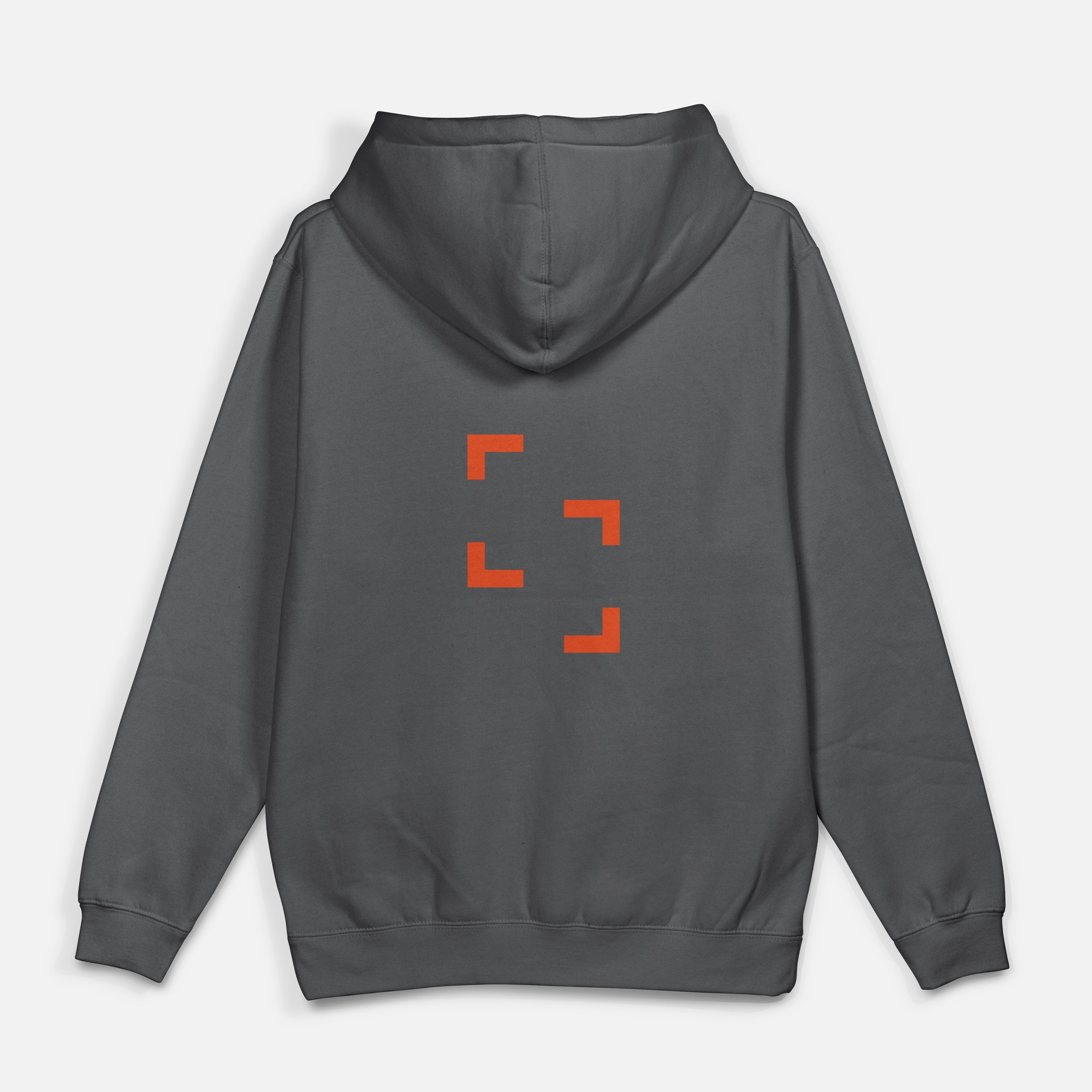
My goal was to create a logo that has a unifying symbol to show the connection between the two museums, and represents the museums mission, which is for people to engage with art and learn more about the past and present. The final logo icon is a mix of a frame and a link, acting like a puzzle piece; two perspectives coming together. The offset frames also represent the location of the two museums, Legion of Honor is located north west, and De young, south east of there. Brand guidelines [here]